We will be waiting a bit longer to drive the new 2024 Ford Mustang before it goes on sale this summer. In the meantime, we just had a chance to poke around the interior for an afternoon and test out the new wall of screens this Mustang is rocking. There’s been much ado about the new interior design that does away with most of the hard buttons, but despite the digital transformation, the new Mustang still feels familiar inside.
Just like the Mustang before it, the seating position is a touch too high even in its lowest seat position. Visibility is still way better than the Chevrolet Camaro, but that’s not saying much. Materials quality is about what you’d expect in a Mustang built to a price. Some of the plastics look nicer than before, but this Mustang is not what we’d call luxurious in touch or appearance.
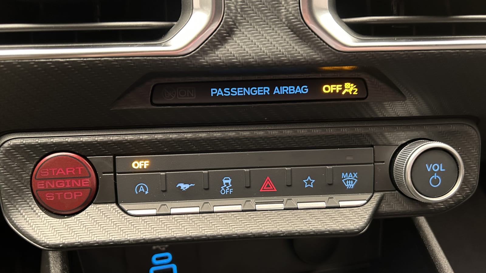
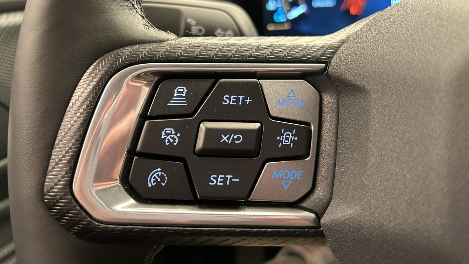
The distinct lack of buttons in the center stack is contrasted by the borderline overwhelming number of buttons on the steering wheel. There are nine each side of the wheel. Even if you count the start/stop and volume knob as “buttons” on the center stack, this area still has less than half the number of controls situated on the steering wheel.
It’s a good thing, then, that the Sync-powered touchscreen infotainment system is rather pleasant to use. Ford stuck all of the relevant climate controls to the bottom of the screen where they remain 100% of the time. Even when Apple CarPlay or Android Auto are put into full-screen mode, the climate controls stick around, allowing instant access to temperature changes, the heated/cooled seats, defrost settings and more. However, if you wish to change the direction of airflow, that requires an extra tap into a climate menu.
Those fundamentals of controlling the car are generally acceptable, but the fun of this infotainment system creeps in when you access the MyMustang menu. Press the galloping horse button below the screen, and Ford’s collaboration with Unreal Engine reveals itself. This 3D computer creation tool allowed Ford to bring video game-like animations and interactivity with the screen. It’s cool if you’re a nerd always diving into the latest innovations in gaming technology, but otherwise, you might not care. The benefit of this fancy software is an unerringly smooth touchscreen experience with graphics you’d expect from a modern video game. When you go through and set up custom drive modes, the specific parts of the car you’re changing will highlight themselves in shocking detail in the Mustang animation on screen. It feels a bit like you’re customizing a car in “Forza Horizon” or “Gran Turismo 7,” but instead, you’re adjusting the damper settings and exhaust noise on your actual Mustang. Other neat features running Unreal Engine are new auxiliary gauges, Mustang track apps, the MyColor customization and digital gauge cluster themes.
Coming from the current Mustang that runs the comparatively rudimentary Sync 3, this new tech is going to really open your eyes. It doesn’t matter if you opt for the big single wall of screens or separate lower-spec screen set up in the Mustang, either — both will get Unreal Engine integration. The only disappointment is that the ever-changing Mustang graphic you get to play with can’t change color. Ford says it keeps them all silver to better match the background, but we would prefer a Mustang graphic to match the exterior color of the exact Mustang you’re in. To take this customization effort even further, Ford should match the wheels, brake caliper color and aero package displayed on screen to the specific vehicle you’re in. As it stands, the generic silver car is a little boring in the context of this powerful gaming software.
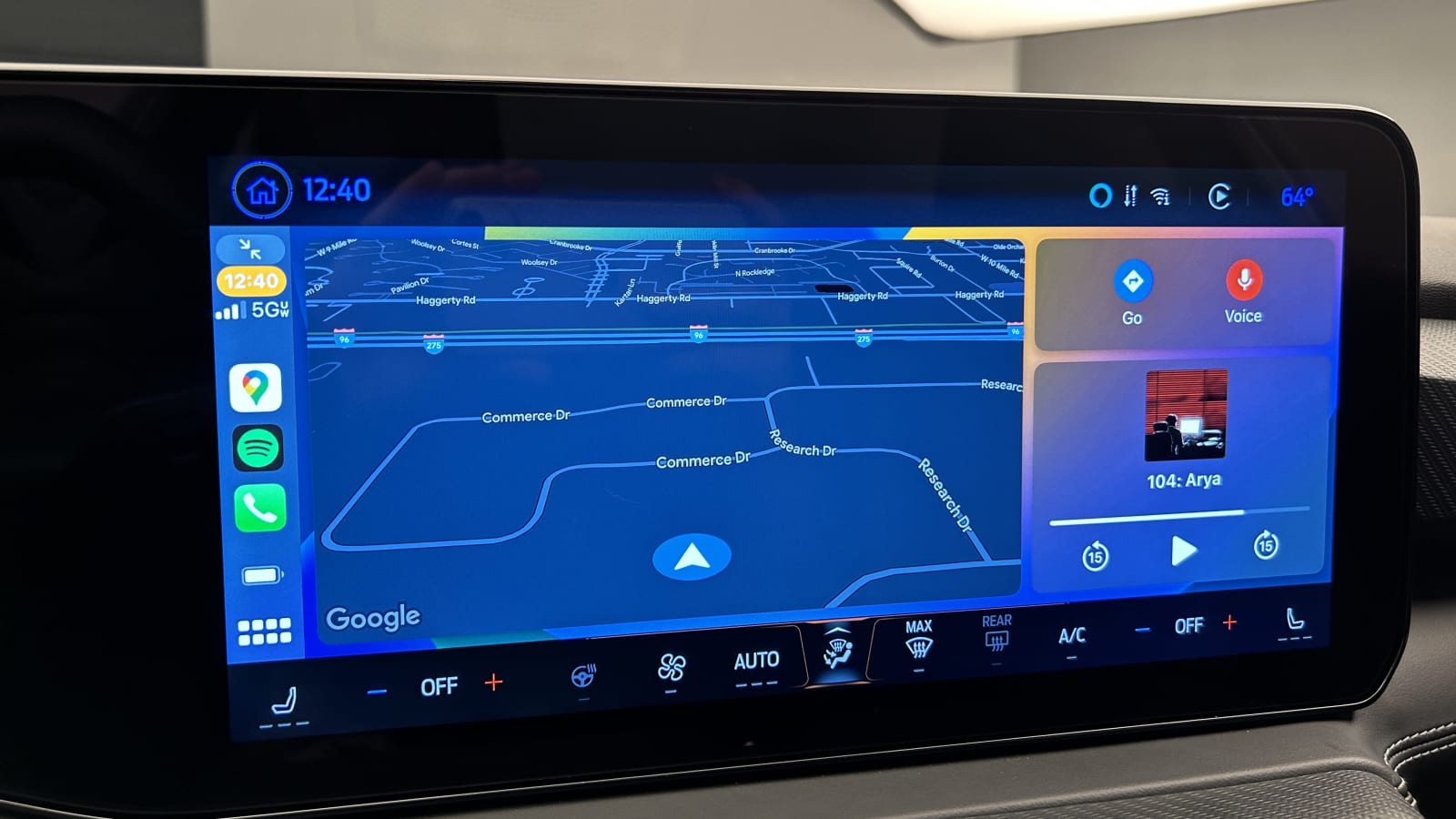
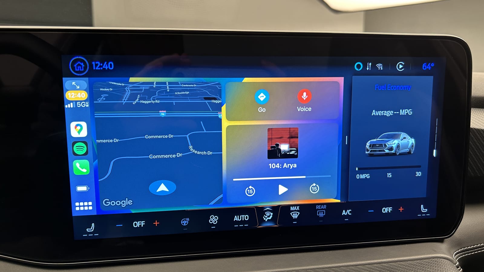
The rest of the infotainment system is pretty standard Ford Sync fare. Its radio is easy to use. The navigation system is nothing fancy, but it’s snappy and has a clean layout. Apple CarPlay and Android Auto can be set to either full-screen or partial-screen mode. The partial screen mode allows you to select from a number of other displays for the far-right portion of the screen. There are also permanently docked menu icons on the left side of the screen, making it easy to go back and forth between the Sync and Apple/Android interfaces. Sync 3 and 4 lacks this and it’s frustrating.
Ford orienting the screen toward the driver is appreciated, as it gives the cabin a driver-focused layout appropriate for a performance car. And lastly, the “star” button in the one row of buttons below the screen is a real rockstar of a button. You can map numerous controls to its operation, but most importantly, you can map the exhaust mode to it. All it takes is a single tap to put the Mustang’s exhaust into “track” mode, and considering the Mustang’s typical clientele, that’s a vital shortcut to have.
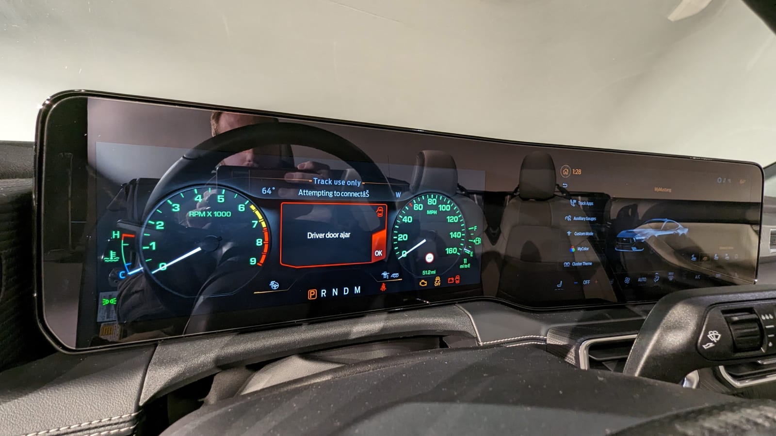
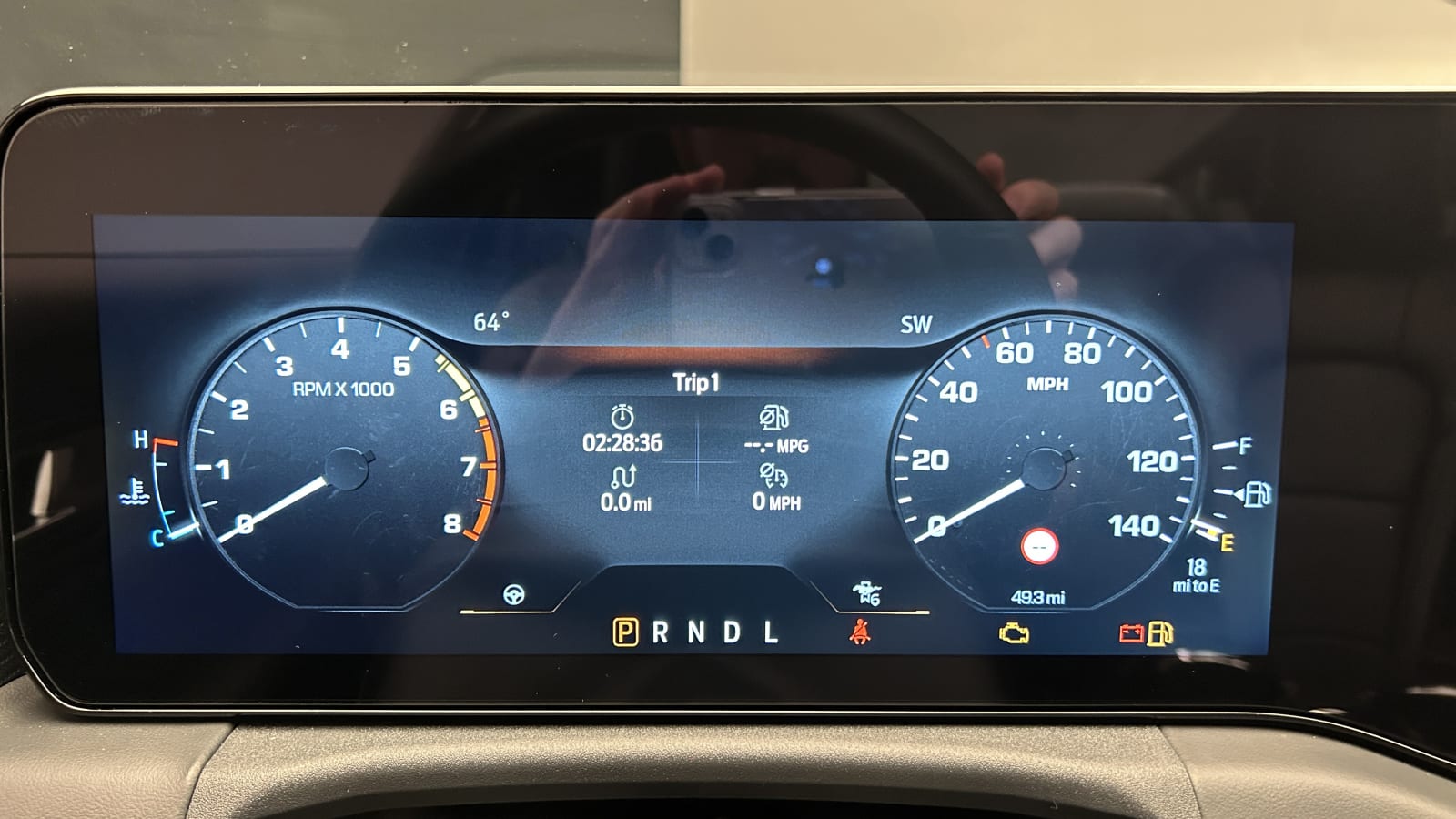
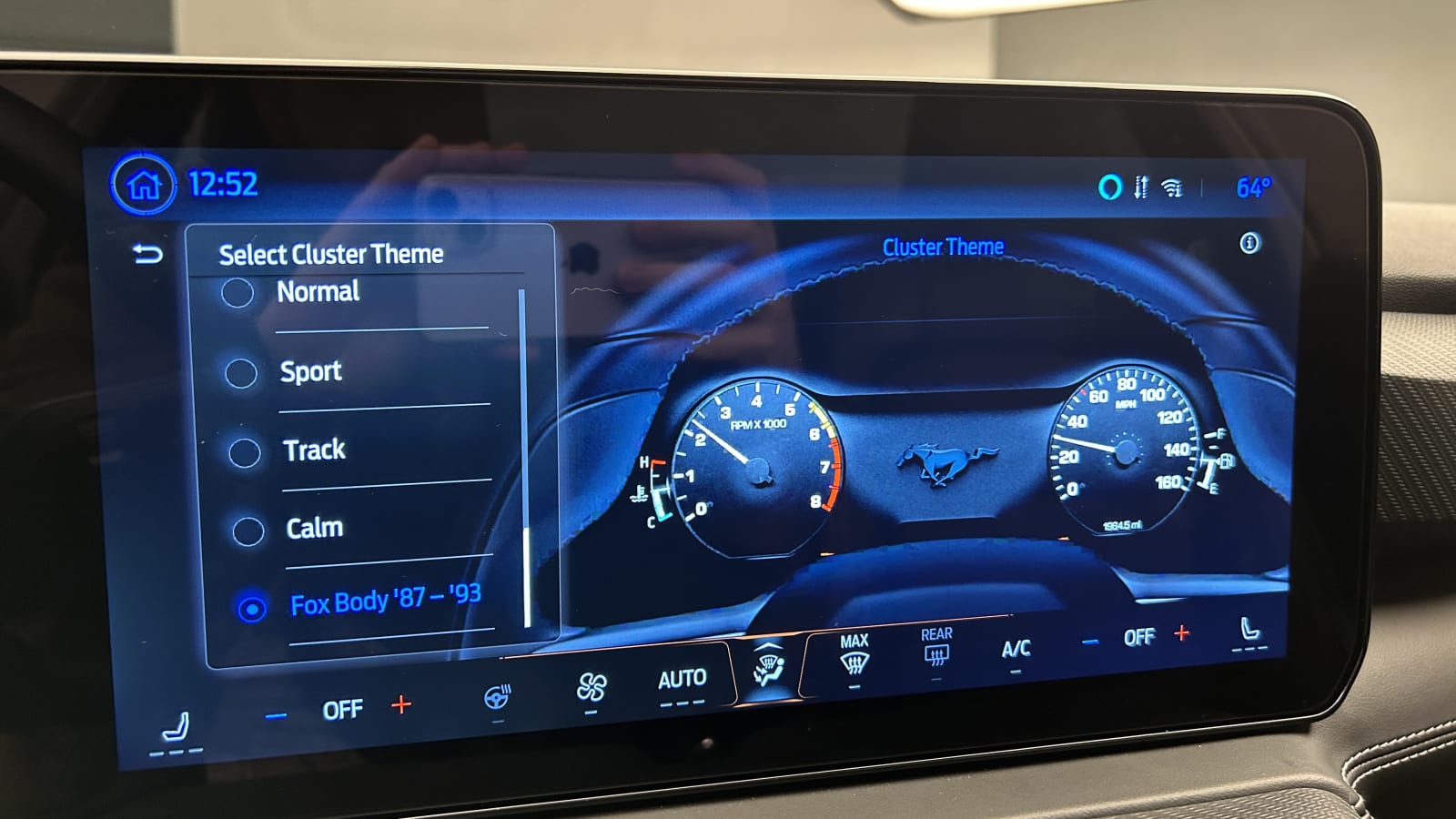
This interior’s last big highlight is the digital instrument cluster. Specifically, Ford added a special 1987-1993 Fox Body Mustang gauge layout for the 2024 Mustang, and it’s rad. You can make it the permanent display no matter the drive mode, or you can tie it to a custom drive mode to only use it on occasion. Any Mustang history enthusiast is going to love it, and the white-backed gauges only get cooler when you flip the headlights on and they switch to green to simulate the green-backed lighting from those older Mustangs. The other display modes are similar to the previous generation’s digital cluster layouts, but they’re tweaked to appear more modern and in keeping with the slick infotainment system. All of the animations between drive modes are especially entertaining, as Ford went all-in on creating smooth, attractive graphics.
As a whole, this Mustang’s interior is going to appeal more to folks who prefer digital over analog experiences. We’re sad to see the sweet airplane-inspired toggle switches go away, but for the most part, Ford’s touchscreen controls are an agreeable evolution. Just like the Mustang Mach-E, this is a screen-controlled interior done with thought and care for the user.
Related video:
