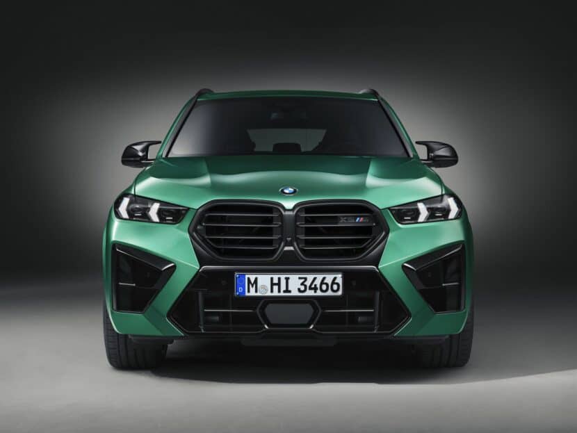
When BMW facelifted the X5 M, it actually changed quite a bit. It has an all-new grille, new headlights, and a unique front bumper design. All of which combine to make an interesting looking new car that stands out from the pre-LCI car quite a bit. However, it’s also significantly different from what we thought it was going to look like, which is evident by how different it is from renders that were made of it before its release.
In renders, the BMW X5 M looked very much like the previous-gen X5 M, just with slimmer headlights and grille surrounds from the X6 M. The rest of it was pretty familiar, though. However, the actual car has horizontal grill slats, versus the classic vertical ones, and an entirely different front bumper. The latter of which features a two-tone paint design, both black and body color, that creates a unique zigzag pattern that flanks the kidney grilles. It’s a design like none we’ve ever seen on a BMW before and the reaction from BMW fans has been interesting to see.
So the only question remains is whether BMW should have stuck with the more traditional BMW design, instead of this funky one? On one hand, the more traditional design fits the X5 M really well, as it’s a pretty simple, handsome looking car. It’s also more in keeping with what fans want from something like an X5 M. People who want more bombastic styling usually go for the BMW X6 M instead, anyway. So it might have made sense to keep the X5 M simple, while giving the all-new face design to the X6 M. After all, it’s the fashion-forward car of the two.
However, on the other hand, the new design is actually quite nice. Personally, I like it a lot and I don’t like many of BMW’s new designs. I think it makes the X5 M stand out from the crowd of similarly designed BMWs without making it look overly brash or obnoxious. The grille slate I still don’t love, as I think all BMW’s should have vertical slats. But I like the rest of it a lot. The zigzag pattern is cool and really pops when the car has a vibrant body color. And I like the X6 grille on the X5, as it makes the car look sportier.
So I leave it to you readers, should BMW have gone with something more traditional or did it make the right decision by making the X5 M more of a standout?
[Render by instagram.com/j.b.cars]

