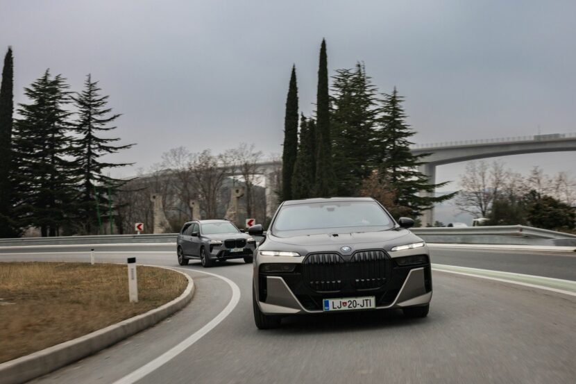
When BMW first introduced its new split headlight design, it did so on two models simultaneously: the BMW 7 Series and X7 (three models if you count the i7 as its own model). The success of that design and those cars will forever be linked because of that. Which is why it makes sense that both the BMW X7 and i7 were brought together for this photoshoot in Slovenia.
Seeing both cars next to each other on the road, you can more clearly see both the similarities and differences in their designs. Both were clearly penned to share the same design language but they’re both very different cars so they wear it a bit differently. Consequently, the both look like siblings but with their own unique attitude.
Both of which have very similar grilles but, oddly, the i7’s seems a bit taller. You’d think the opposite would be true, given the X7’s extra front end mass, but the X7 actually seems to have smaller grilles with less visual clutter. Part of that is the blacked out front end of the i7, which features very little body color. That gives a lot of visual negative space but ends up removing some of its character in the process. While the X7 is a bit more normal and lacks the blacked out panel. For that reason, it’s a bit more charging and welcoming.

As for their headlights, both cars get the same split headlight design, something that’s caused a bit of controversy since their launch. The upper portion of the headlight is an incredibly slim LED strip, featuring two lights that hark back to the dual halos of classic BMWs. That upper portion handles turn signals primarily. While the lower portion is almost hidden behind a tinted panel and handles both main and high beams. Both cars’ headlights look pretty much the same and even have very similar bits of fang-like design that hang down from them.
Personally, I think the X7 looks better, which is shocking given my distaste for most SUVs. I just don’t love the i7’s upright front end and miles of black plastic. However, I can see why some people might like it’s more aggressive design. In the end, you can tell both cars are cut from the same design cloth.
[Photos: Nejc Pernek (@nejc.pernek) and Rok Mlinar (@mlinarrok) for BMW Slovenia]
