[This post is an update from 2018]
Photos can make or break a website. You might have a wonderful design that’s sleek and easy to navigate, but you still need photos that will sell the experience in a way that written content just can’t.
But what photos will sell your tours? To help tour operators with this, we at TourismTiger have created a guide with the photos that every tour operator needs on their website.
The beautiful scenic shot where your tours happen
Above hero shot: Portuguese For a Day
The photo in the above example serves as a visual ambassador for city tours in Lisbon, enticing potential visitors with the promise of an authentic, culturally rich, and visually stunning exploration of the city’s charming streets and architectural wonders. It’s an image that whispers, “Come, wander with us, and let Lisbon unveil its secrets one step at a time.” Most people will already know that your location is beautiful since that’s probably a huge reason why they’re coming to your corner of the world in the first place, and these scenic shots serve as a great reminder of what is in store for them.
A beautiful scenic shot can make for a gorgeous website as they are some of the most eye-catching photos. Keep in mind though that these types of photos should be used in moderation as there are other types of photos that should also be used to balance things out. Scenic photos work best for websites that focus on city tours of a particular location that could include a view of a famous landmark or monument, as well as tours that take visitors to mountainous areas or the countryside.
Photos of people having fun on your tours
The photos of people on your tours are the most important photos to have on your website. The experience that you offer can only be shown with photos or videos that show real people enjoying their day with your company. The photo should show people having fun, laughing, and engaged in the activity.


Above gallery photos: High Tide Los Cabos
These photos do a great job of showing people in action during the tour. Website visitors can tell that they’re not just going to be walking around, or spending the time in a bus, they’re going to be active. Not just seeing, but doing and experiencing.
If there’s a certain demographic or type of person you want to target your tour company to, then make sure to show these types of people in the photos. For example, if you’re looking to have more families on your tours, make sure your primary photos feature them.
The photos of people on the tours will also give guests an idea of whether or not they’re able to do the trip. If an elderly couple looks at the site and sees that everyone is very young and athletic looking, they may decide that your tour company isn’t for them. If you’re trying to attract everyone, make sure there is a mix of people.
Photos of your qualified guides
People want to see who they’re going to spend the day or days with. The photos of guides should show some personality. Make sure people know that they’re going to be in good hands with someone who seems fun and professional. The photos should show that guides are friendly, un-intimidating, and experts of their craft! Here’s a great example from our client from Southeast Alaska Adventure:
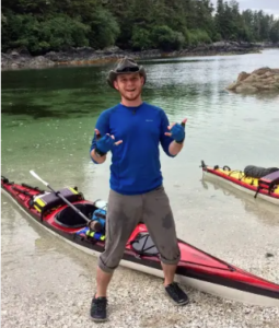
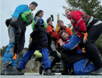
The first photo is of the company owner, who is also the knowledgeable guide and qualified kayak instructor leading these tours and courses. This photo is complemented with a bio which gives us more insight into who this person is, and why we want him as our guide! The second photo is of the same guide participating in a fun group photo with his tour goers. Both photos show a fun, friendly group, each demonstrating the guide’s easy-going personality.
Photos of your guides interacting with guests
It’s of course necessary to also show guides and travelers interacting. Website visitors should be sure that the experience will be personal and engaging, not just a stranger repeating the same thing every day to a different group of people.
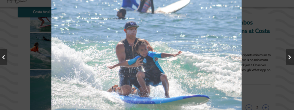

From the examples above, the website visitors can get an idea of the expertise their tour operator will have. The first photo from High Tide Los Cabos shows the guide, or instructor in this context, literally aiding the visitor during the activity to help her accomplish standing up on the surfboard. In the second photo you can see the tour goers attentively listening and observing what their MTLDetours tour guide is showing them.
Show what makes you special
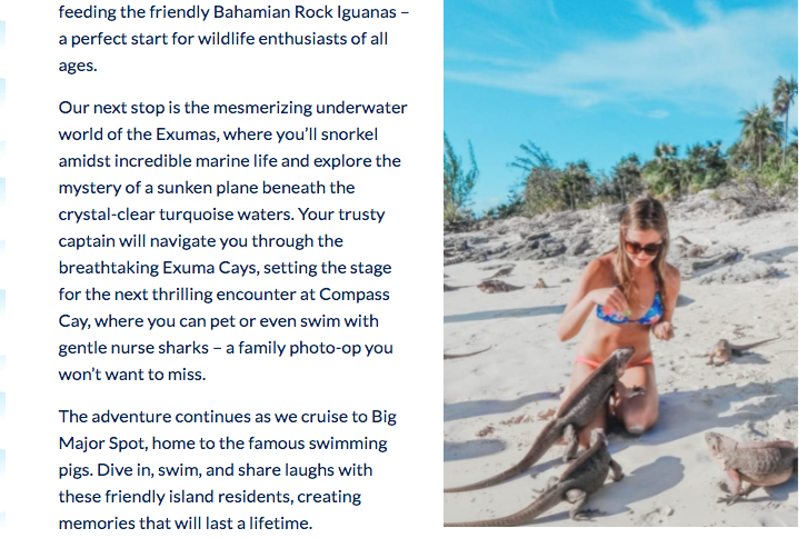
There are so many tour companies, and you have to stand out. Your website’s photos should show why you’re special. For example, Bahama Blue Water Adventures offers incredible Bahama Boat Tours that include snorkeling and exploring secluded islands. Travelers get to see amazing marine wildlife on their tours such as pigs, iguanas, nurse sharks and more, so of course this is something they should show off on their website. Their photos show not only people on the tours, but the guests interacting with incredible Bahamian wildlife during the experience.
Use your photos to ease people’s fears and answer their questions
Think of what questions your content can’t perfectly answer, and use photos to demonstrate it to your website visitors. For example, if you’re a white water rafting company with beginner, intermediate, and expert level tours, you should use your photos to demonstrate that the beginner is for everyone, so someone who is looking at the tour page will know straight away that they can handle it. You can achieve this by having an action photo of rafters on very mild rapids. Additionally, you should make sure that your intermediate photo doesn’t look more intense than the expert level tour. Make sure it all makes sense with the content, and you will give potential customers the best possible idea of the experience.
Show off your gear
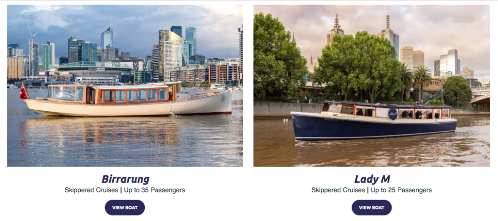
If your tour is done with any type of essential gear, such as vehicles, bikes or boats, make sure to show them off on the website. People want to feel safe and secure, and they want to see that you have a modern vehicle or equipment that will be reliable on the tour, not some old beat-up bus that will break down or be unsafe. In the example below, Melbourne Boat Hire exhibits each of their vessels beautifully with high quality images showing off their clean, secure and well maintained fleet, with the bonus of a scenic background, and accompanied by the specifications of each boat.
Death of the stock photo
Avoid using stock photos on your website. Oftentimes, potential customers can tell that they’re stock photos, causing them to distrust you from the get-go. You don’t need a professional photographer to take great photos. You can actually take great photos with just about any type of mobile phone these days, and some understanding of the phone’s camera setting.
If you simply must use stock photos on your website, our favorite site is Unsplash. They offer beautiful, free photos that don’t scream stock photo.
User-generated content
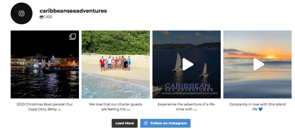
And finally, all websites should have user generated content in some form. A great way to do this is to have an Instagram feed on your site. With a third-party application like Regram, you can repost photos that your guests have taken onto your own account, which will then appear on your website. This is a feature that all TourismTiger sites are compatible with, like on Caribbean Sea Adventures website:
Integrating captivating photos onto your tourism website is paramount. As humans, we are inherently drawn to visual stimuli, and attractive images act as powerful magnets, instantly capturing the attention of potential customers. In a competitive landscape where first impressions matter, compelling photos not only showcase the unique experiences that your company offers but also evoke a sense of anticipation and desire in prospective clients.
Remember, you might have a fast, easy to navigate site, but it won’t help you sell more tours if your photos don’t show people the personality of your tour company or what makes it special. We hope this guide will help you improve your website and sell more tours. Questions? Contact us today!
